Basic Instinct 2 email...It's as Bad as the movie
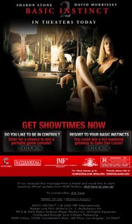 For those of you who remember the shockingly graphic scenes from Paul Verhoeven's first Basic Instinct movie, you undoubtedly have a whole new meaning for an ice pick. Well after clicking through the promotional email for "BI2", I want to take that ice pick and take out my eyes. This piece of creative is lackluster and the strategy, while it uses a Drive-To-Web structure (which is great), the execution gets Two Thumbs way down. And they had such big brand partners too - Sony PSP, FHM and Casa Del Mar. Very surprising.
Let's take a look at how the email works, or in this case doesn't:
1. HTML email - Good striking imagery of a well-preserved Sharon Stone (Catherine Trammel) sitting seductively in a chair; smoking cigarette in hand and dress slit up to her...well...you know. She's sitting front of a shattered mirror with her victim in the reflection. It's a great image. But how hard could it have been to make the smoke animate or at least glow like it's lit? Missed opportunity #1. However, it did compel me to choose from 1 of the 2 choices and make a click.
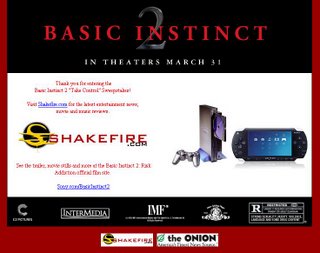
2. Transition - First I chose to "be in control", but what I got was a web page full of text and a tiny image of a PSP. Way too much text and nothing very compelling at all. Plus there was a survey and then a huge profile to fill out. For what? The questions were actually quite funny if you actually read them, but no one gave me a reason to do so. Missed opportunity #2. The other choice was equally as poorly executed, but at least there was a more compelling background graphic.
 (click on these images to see what happened when I clicked the email image)
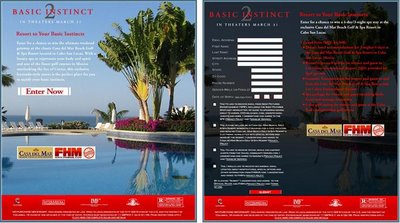 (these emails were actually each presented vertically, but I reassembled for spacing on this blog)
 With all the promise and possibilities that rich media marketing can now provide, I couldn't have been more disappointed in this. MGM needs to be ashamed. I want my money back.


